Published
16th Jan 2026
Pinterest’s annual colour forecast highlights five emotionally driven hues expected to influence beauty, nails, salon design and branding in 2026
Pinterest has unveiled its Pinterest Palette 2026, revealing five bold colours predicted to shape creative, consumer and design decisions over the year ahead. Drawn from the searches and saves of more than 600 million monthly active users, the annual colour forecast offers early insight into where colour demand is heading across beauty, interiors, fashion and branding.
The 2026 palette marks a decisive shift away from muted neutrals, instead embracing full-volume colour with emotional impact. According to Pinterest, consumers are increasingly using colour to regulate mood, express identity and create a sense of grounded optimism amid cultural noise.
For makeup artists, nail technicians, salon owners and beauty brands, the palette offers practical inspiration for treatments, décor updates, seasonal launches and refreshed visual identities.
The five colours defining Pinterest Palette 2026
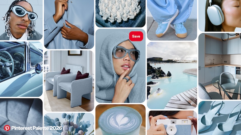
Cool Blue: a sharp reset for beauty and interiors
Cool Blue is described as a frosty, ice-cold shade that delivers clarity and focus. After years of beige and neutral palettes, Pinterest positions Cool Blue as a visual “reset button” for 2026.
Search growth linked to the colour includes:
- Cool blue (+85%)
- Glacier aesthetic (+35%)
- Icy nails winter (+230%)
In professional beauty, Cool Blue translates easily into winter nail designs, minimalist salon interiors, and clean, modern branding with a clinical-meets-cool edge.
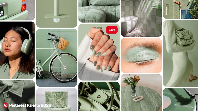
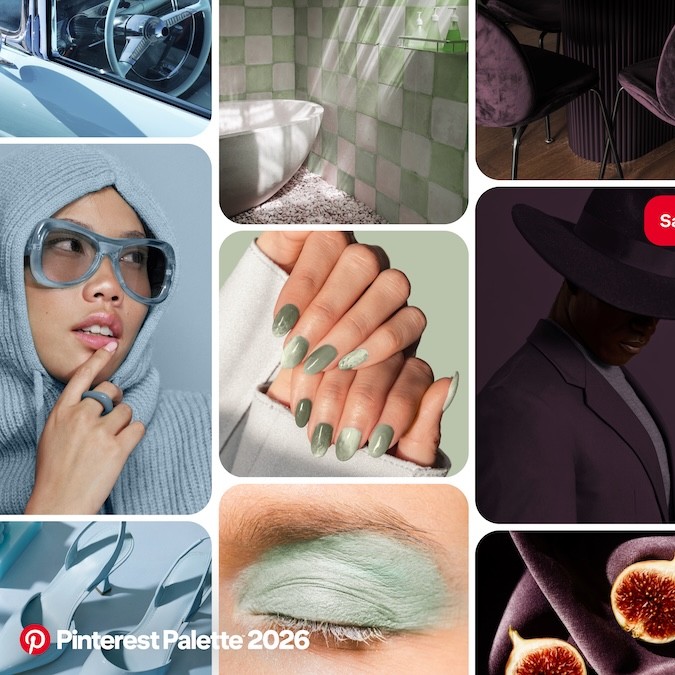
Jade: the new sophisticated green neutral
Positioned between mint and moss, Jade blends serenity with quiet luxury. Pinterest notes that as consumers prioritise “fewer, better things”, Jade functions as a timeless, elevated neutral across interiors, jewellery and beauty.
Search growth includes:
- Jade marble nails (+450%)
- Jade accessories (+135%)
- Jade texture (+40%)
For salons and studios, Jade lends itself to marble nail art, spa-inspired décor, and premium branding that feels calm but considered.
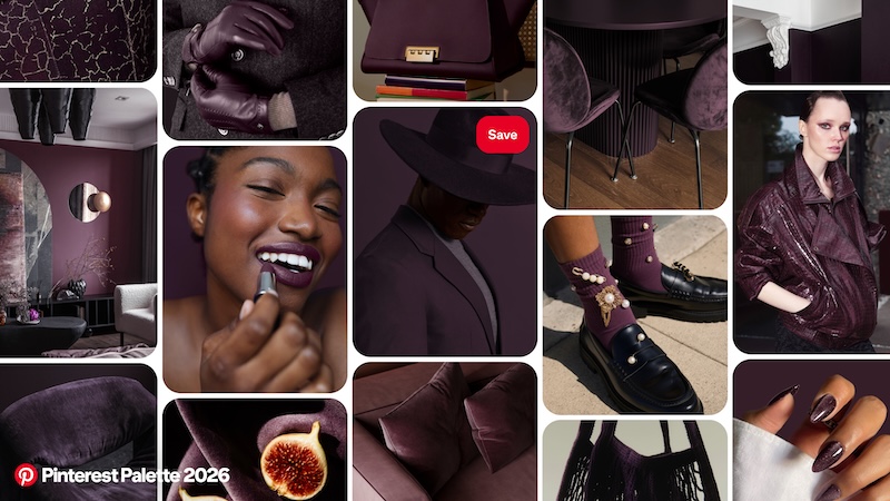
Plum Noir: depth, drama and confidence
Plum Noir is a deep, decadent mix of purple, burgundy and velvet brown. Pinterest frames it as a rejection of youthful pastels, offering instead a colour that signals complexity, boundaries and self-assurance.
Related search growth includes:
- Deep burgundy (+230%)
- Dark plum (+220%)
- Dark purple shades (+40%)
In beauty, Plum Noir works across moody makeup looks, high-impact nails and dark, atmospheric interiors that feel luxurious rather than playful.
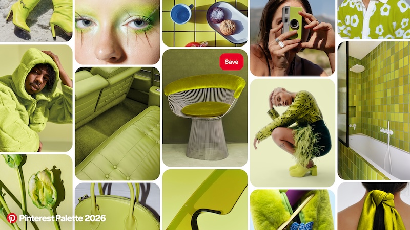
Wasabi: high-voltage colour for Gen Z aesthetics
Wasabi is an electric chartreuse green, described as untameable and energetic. Pinterest links its rise to Gen Z’s cyber-Y2K aesthetic and demand for colours that pop both on screen and in real life.
Search growth includes:
- Chartreuse green (+175%)
- Lime green weddings (+70%)
- Yellow green outfit (+55%)
For makeup artists and nail techs, Wasabi offers standout potential for accent nails, editorial makeup and digital-first content, while salons can use it sparingly for statement features or signage.
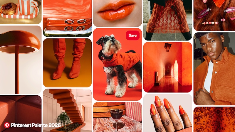
Persimmon: warmth, nostalgia and joy
Persimmon blends orange and red into what Pinterest describes as a “sweet-heat” shade driven by nostalgia for 1970s glamour and a desire for real connection.
Search growth includes:
- Orange colour suit (+105%)
- Persimmon aesthetic (+100%)
- Orange colour combo (+75%)
Persimmon is well suited to warm-toned makeup, sunset nail palettes, and salon refreshes that aim to feel welcoming, energising and emotionally uplifting.
Why colour matters more in 2026
Pinterest says consumers are increasingly seeking “colour with emotional utility” – shades that help reset mood, sharpen focus or inject joy into everyday life.
“For a long time, the safest choice was to keep things quiet and neutral. Now people are ready for more,” said Xanthe Wells, VP of global creative at Pinterest. “Pinterest Palette is an invitation to be a little louder with how you feel – to play, to experiment and to let your world reflect the life you actually want to live.”
This emotional approach to colour has clear relevance for the professional beauty industry, where visual cues strongly influence client perception, brand trust and purchase intent.
How Pinterest forecasts colour trends
Pinterest Palette is built using a combination of:
- Human behaviour signals from billions of searches and saves
- Proprietary visual search technology
- Expert curation from in-house colour specialists
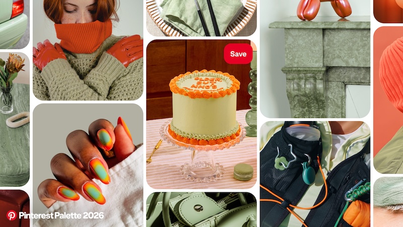
Pinterest analyses not just individual colours, but how they appear together across categories, identifying entire aesthetic worlds forming on the platform. New for 2026 are sub-palettes, including combinations such as Cool-Wasabi and Persimmon-Plum, designed to help brands and creatives layer colour with greater impact.
What the palette means for beauty businesses
Pinterest describes colour as one of the fastest ways consumers signal taste and intent. Caroline Orange Northey, managing director, UK & Ireland at Pinterest, said the palette helps brands stay culturally relevant by translating early search behaviour into practical creative direction.
The platform cites brand activity informed by previous Pinterest Palette trends, including campaigns that used immersive creative and interactive tools to move users from inspiration to action.
For beauty professionals, Pinterest Palette 2026 offers a data-led foundation for:
- Nail colour menus and seasonal collections
- Makeup trends and editorial looks
- Salon redesigns and décor updates
- Branding refreshes and digital content
You might also like:

VVVwinbet is where it’s at if you want to win. I’m not saying it’s guaranteed wins, but it’s been treating me well. Give it a shot and maybe you’ll get lucky! Click here to get started: vvvwinbet
Just finished the Playtime app download. Let’s see if it’s worth the hype everyone is talking about. Download it here: playtime app download